Taking a break from the design of levels to go back through the game and give the UI a bit of a polish. To start off I wanted to improve how the level select are looked. Previously the UI had used tinted rectangles and a strong white outline for panels and buttons and although it look fine I felt it needed a bit more style.
After playing Stellaris for a few hours I came to realise how nice but relatively simple their UI was, so I decided to take a leaf out of their book and have a play in Affinity Designer to see if I could improve the UI in Reflex.
The screenshot below shows the original UI design (taken from a very early build of the game).
The Original UI Interface
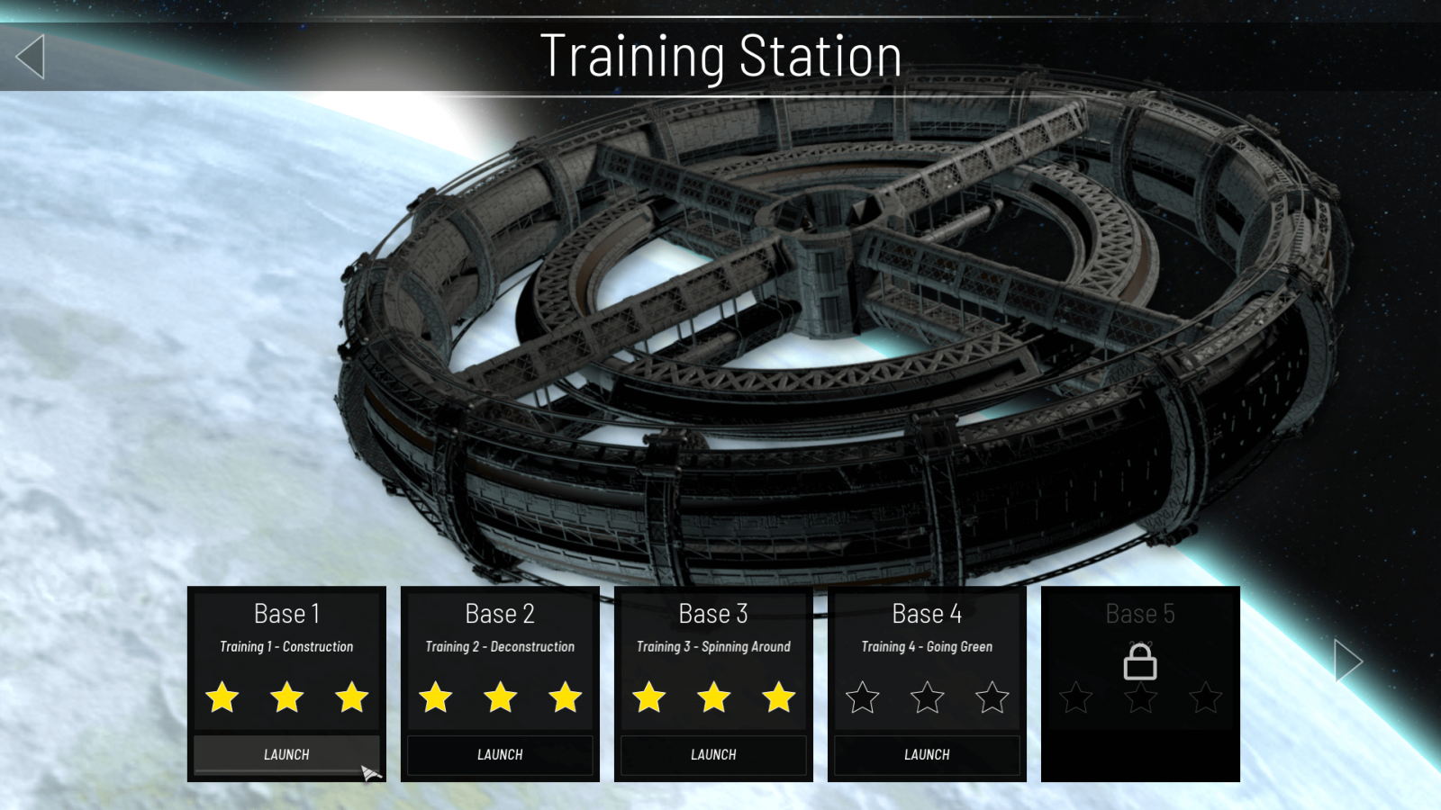
The new interface uses overlapping semi-transparent rectangles to give the display more depth, and the buttons which previous just showed with a yellow outline and text on mouse over were changed entirely so that not only do they have a tinted background on rollover but also have a scanline pulse across the button giving them a little bit of animation.
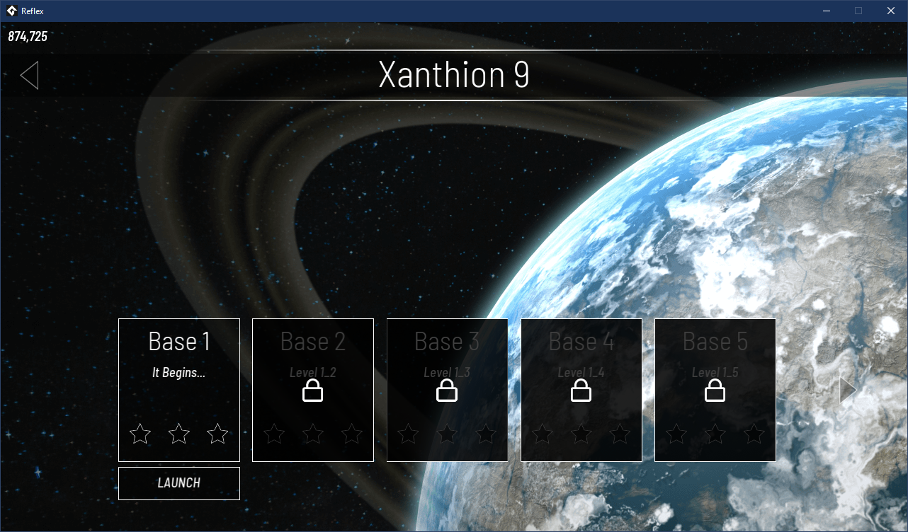
The new UI Interface (Part 1)
I’ve also applied the button style to the World Select screen and I will be looking at the section title and arrow buttons shortly, then I’ll improve the level objective and tutorial panels along the same lines.
I’m also keen to look at perhaps adding in 4K UI layouts to avoid the resolution looking a bit blurry with scaled up text (game graphics are all fine as the screen is configured to display at full resolution and allow more of the map to be viewed at once.